The altexsoft.com design system, from Figma to code
AltexSoft's website kit had grown for years inside page mockups and an old library. With a second designer, I turned it into one design system that Figma, code and AI agents read by the same names. I built the tokens, the export to code and all of the code, and part of the Figma library.
Decision summary
One name in every layer, from Figma to the component. 59 components match in Figma and code, a real page was rebuilt from them alone, and this portfolio is the first project to take the tokens.
01 / The starting point
A kit that grew
inside the mockups.
altexsoft.com was being redesigned. Its UI kit had grown for years inside the page mockups and an old shared library, and nothing connected it to code. AltexSoft's UX design group took it on as a practice project: one design system that Figma and code share, ready for AI-assisted development.
- 15page mockups, about 15,000 component instances
- 69 + 119component sets and standalone components in the kit, and about 100 more drawn on the pages
- 7sets for the same post card, about 2,700 instances between them
- 36 of 59component sets still bound to an old library the file could not load
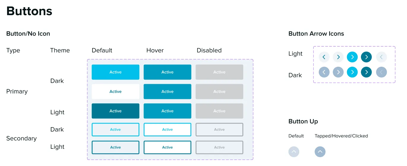
Buttons drawn as a table: every cell labelled Active, a picture per theme.
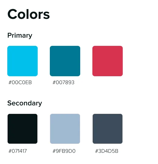
Colours as hex values, with no names or roles.
Also in the file
- About 200 variables, each with one mode: no themes, no descriptions, no code names
- Three spacing scales that disagreed, and typos and placeholders in token names
- No shadows, breakpoints or mobile type sizes as tokens
- Variants that stood for prototype frames, such as FAQ Line 1 to 6, not for states
- No code
My part
Mine
- The token architecture: four variable collections and every text, shadow, gradient and grid style
- The export from Figma to code, its validator and the CSS it generates
- In the Figma library: icons, buttons and links, form controls, page navigation, the dark theme
- All of the code: the components, the documentation site and the check page, written with AI coding agents
- The decision log
The second designer's
- The brand art: pictograms, illustrations, the logo, social icons and flags
- The badges and cards, the header, menus and footer, the overlays and the sections
Two designers, about three weeks from the audit to components in code. The decisions were made together, and recorded in one log.
02 / One name in every layer
One name,
from Figma to the agent.
An agent builds with what it can read. When Figma and code use the same names, and every token and component says what it is for, a request for a call to action gets the system's Button instead of a new teal box. Here is one role, followed through every layer.
-
Figma variable
color/primaryA semantic role with a mode for dark sections and a mode for the dark theme. Its description: Main brand color: primary button fill, accent text, active states.
-
Token file
"primary": {
  "$type": "color",
  "$value": "{default.primary}",
  "$extensions": { "com.figma": {
    "codeSyntax": "var(--primary)" } }
}
W3C Design Tokens (DTCG) JSON, exported from Figma and validated.
-
CSS and Tailwind
--primary: var(--theme-default-primary);
class="bg-primary"
Generated from the token file. Nobody edits it by hand.
-
Component
Get in touch<Button variant="primary">The same variant names as in Figma.
-
AI agent
Components use only semantic roles.
No palette utilities, no hex values.
From the repository's agent rules, which coding agents read before they write a line.
Seven roles on three surfaces
A role keeps its name everywhere; the surface and the theme decide its value. The swatches below are drawn by this page's own CSS variables.
| Role | Light page | Dark section | Dark theme |
|---|---|---|---|
--primary Primary button fill, accent text, active states. | #007893 | #FFFFFF | #007893 |
--primary-text Primary as text, icon or line on the page: outline buttons, titles, chevrons. | #007893 | #FFFFFF | #00C0EB |
--link Links in body text. | #007893 | #00C0EB | #00C0EB |
--background The page. | #FFFFFF | #191E37 | #0A0C1A |
--card Cards, menus and dialogs. | #FFFFFF | #FFFFFF | #12162B |
--muted Muted sections, soft chips, backdrops. | #EEF3F7 | #143B5B | #191E37 |
--border Dividers and card borders. | #D6E2EB | #FFFFFF at 20% | #FFFFFF at 20% |
03 / Tokens
Decide once.
Switch by mode.
Tokens are layered so that each decision is made once. The palette sits at the bottom, roles are named on top of it, and modes switch the roles for the dark theme, dark sections and phones. A component never knows #007893; it knows color/primary.
-
1. Primitives
138 tokens
One mode
The raw palette and scales: colour ramps, spacing, corner radius, font sizes and line heights named by their pixel value, breakpoints. Hidden from designers' colour pickers.
-
2. Semantic
83 tokens
default and inverse
What components bind: colour roles named by purpose, spacing and radius. The inverse mode is a dark section.
-
3. Theme
84 tokens
light and dark
The values behind the colour roles, one set per theme. Hidden from pickers: components never bind them.
-
4. Responsive
13 tokens
desktop and mobile
Heading sizes and page margins for phones.
Plus 44 styles for text, shadows, gradients and grids, built from these tokens: 318 tokens and 44 styles in all. The export is validated in every combination of theme, surface and viewport, eight of them.
The same components on three surfaces
Nothing here is recoloured by hand. Each panel sets one class, and the roles take that surface's values. Cards that paint their own surface stay on the default one, so a card in a dark section stays white. Tab through the buttons to see the focus ring on each.
Section header
Let's talk about your product
A dark section and the dark theme reuse the very same Button, Badge and card.
Read more- News
- Event
- Insight
Design systems meetup: tokens in practice
Section header
Let's talk about your product
A dark section and the dark theme reuse the very same Button, Badge and card.
Read more- News
- Event
- Insight
Design systems meetup: tokens in practice
Section header
Let's talk about your product
A dark section and the dark theme reuse the very same Button, Badge and card.
Read more- News
- Event
- Insight
Design systems meetup: tokens in practice
Phones get their own heading sizes
The responsive collection holds the four heading sizes and the page margin. Below 768px the mobile mode takes over; body text stays the same size on both.
| Token | Desktop | Mobile |
|---|---|---|
Title/h1 | 48 / 56 | 36 / 44 |
Title/h2 | 36 / 48 | 28 / 36 |
Title/h3 | 24 / 32 | 20 / 28 |
Title/h4 | 18 / 26 | 18 / 26 |
Page margin | 80 | 16 |
04 / The library
Components bound to roles,
not drawn as copies.
Every component was rebuilt on the tokens, with complete variant sets: sizes, states and dark sections. Old instances were swapped in place, and nothing was deleted until its replacement was ready. The look stayed as it was unless accessibility needed a change.
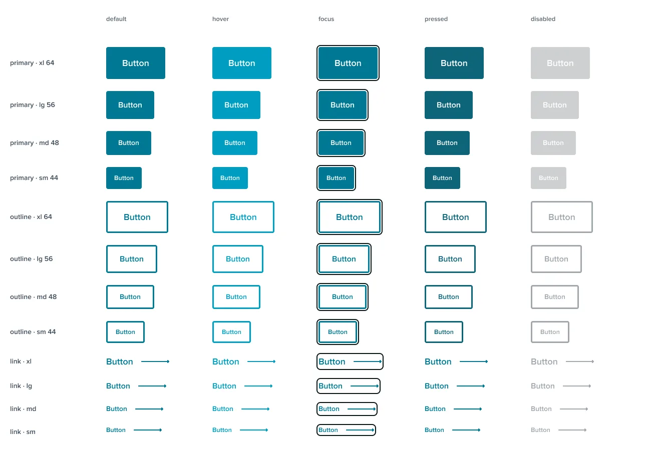
Button: one set, every state
Three variants, four sizes, five states. The dark-section look comes from the tokens, so there is no second set to keep in step.
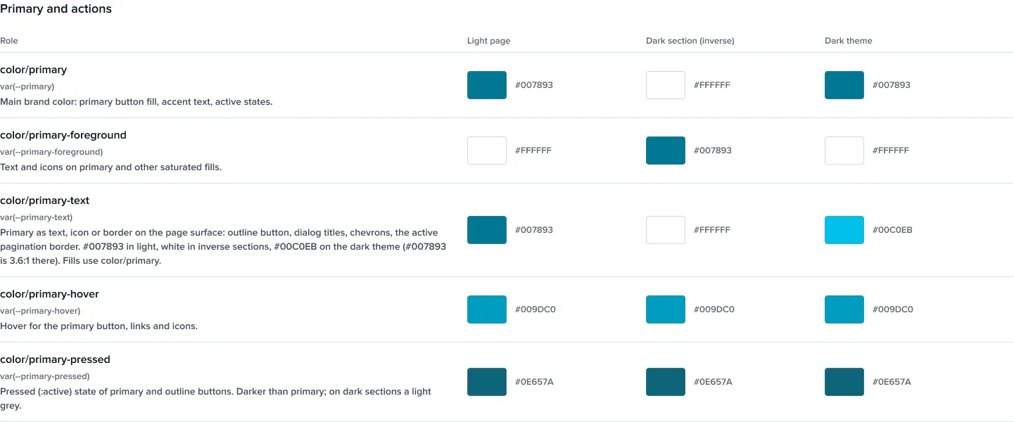
A role says what it is for
Each colour role carries its CSS variable, its purpose and its value on a light page, in a dark section and on the dark theme, so a designer picks by meaning, not by hex.
Old sets became one component
| Component | Replaces | Instances on the mockups |
|---|---|---|
| Button |
| about 1,065 |
| PostCard |
| about 2,000 |
| Chip, ChipGroup |
| about 950 |
| IconButton |
| about 585 |
| CaseStudyCard |
| about 525 |
| Badge |
| about 350 |
59 components in eight groups, each in Figma and in code with the same name:
- Assets6
- Actions4
- Forms11
- Navigation13
- Content5
- Cards9
- Overlays1
- Sections10
05 / In code
A change in Figma
reaches code in one command.
The tokens leave Figma as a file any tool can read, and the CSS is generated from it. Components are written against the roles, not the values, so a token change reaches every component that uses it.
-
Export
A Figma plugin writes every variable and style to DTCG JSON, with its description, scopes and code name.
-
Check
A validator checks the export. A contrast script checks every text pair in every mode.
-
Generate
brand.css is generated: a CSS variable for every role in every mode, and the Tailwind theme.
-
Build
Components wrap shadcn/ui primitives with brand variants and use only roles.
-
Document
A documentation site: 8 foundation pages and a page for each of the 59 components.
npm run tokens:pull Figma to JSON to CSS, in one go.
A page for every component
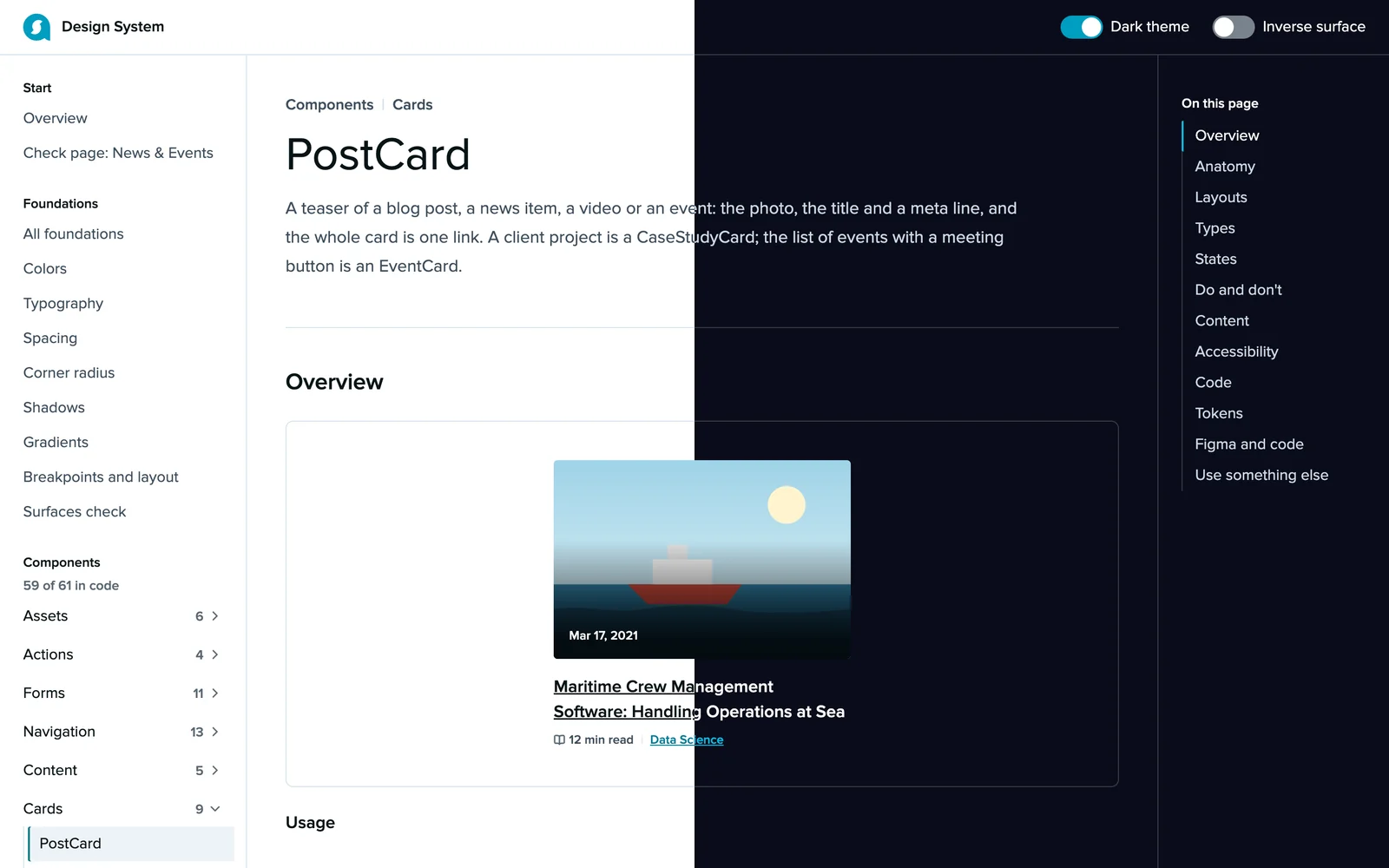
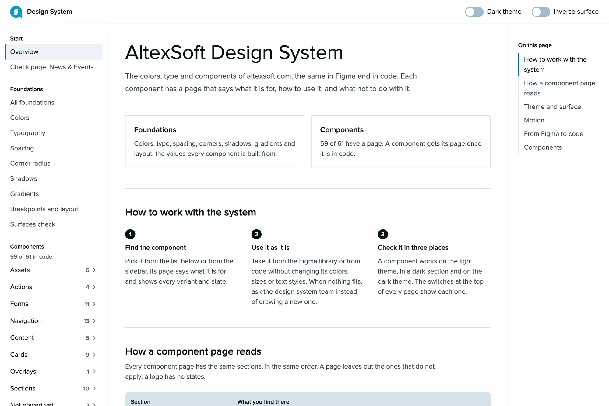
The documentation site shows each component's anatomy, variants and states, its do's and don'ts, its accessibility notes and its code. A switch at the top shows every page in the dark theme and in a dark section.
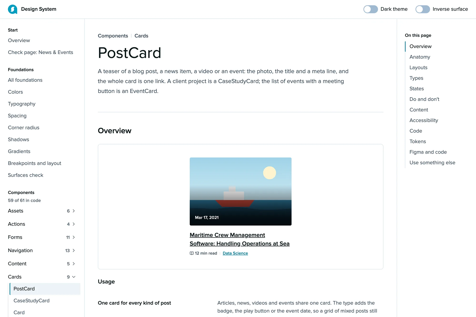
PostCard in the light theme.
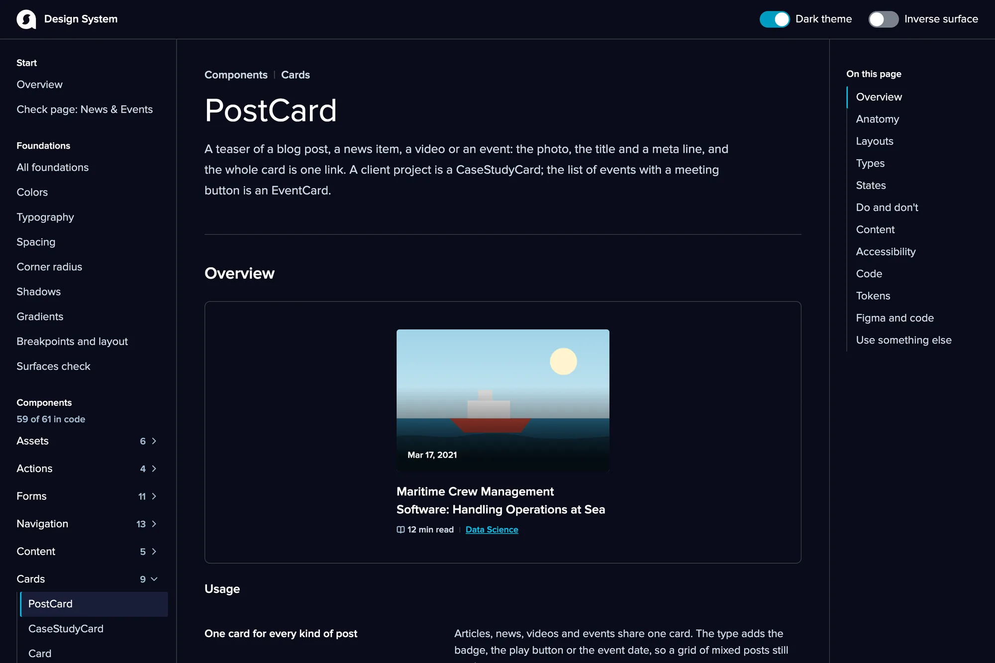
The dark theme: a token switch, not a second set of components.
From the documentation site
-
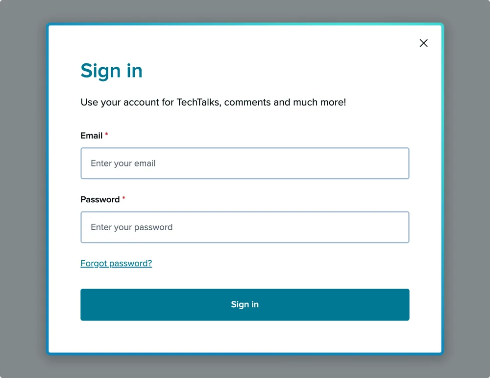
Dialog
Overlays
-
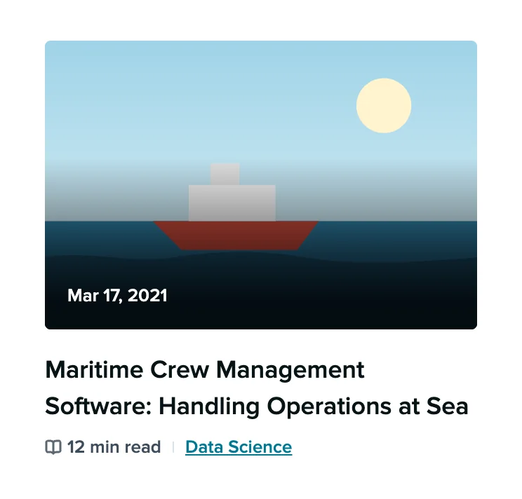
PostCard
Cards
-
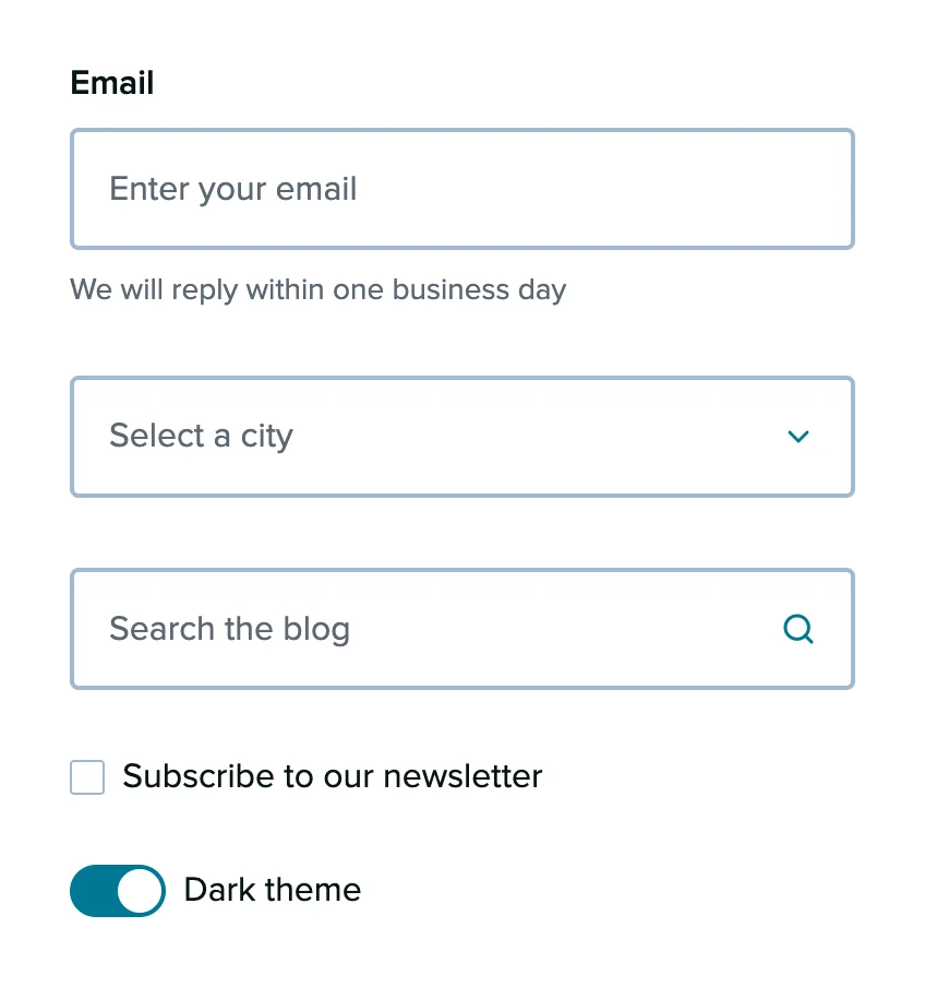
Field, Select, SearchInput, Checkbox, Switch
Forms
-
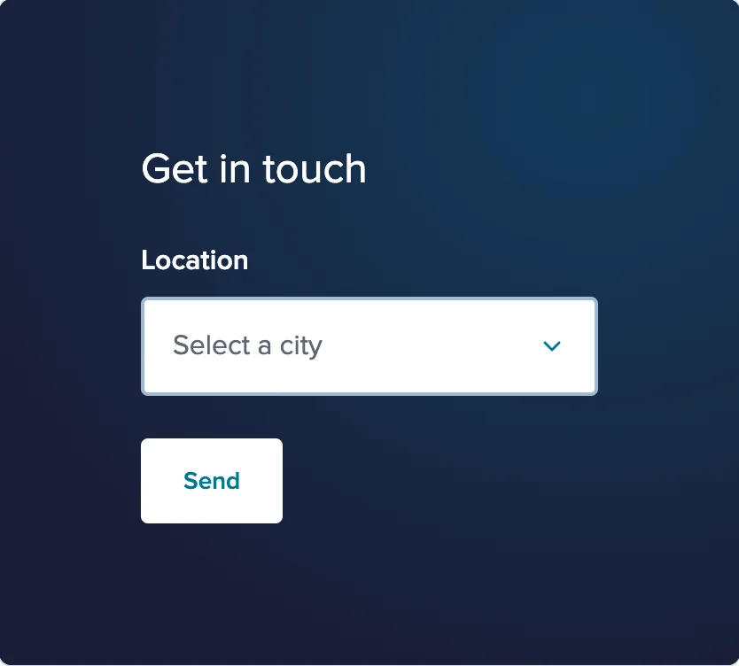
Section, dark
Sections
-
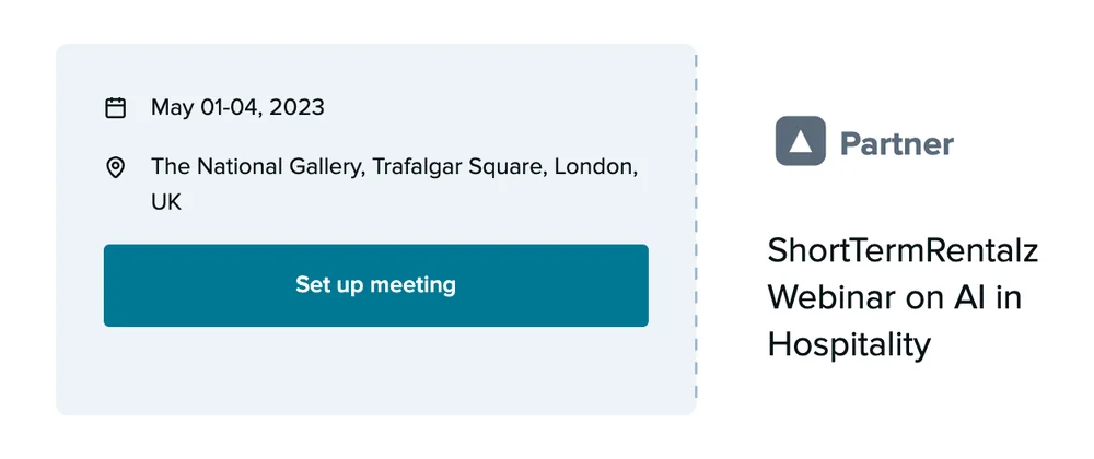
EventCard
Cards
-
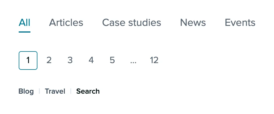
Tabs, Pagination, Breadcrumb
Navigation
-

CaseStudyCard
Cards
-

StatCard
Cards
06 / One real page
One real page,
built from the system alone.
To prove the system holds, one page of the site, News & Events, was rebuilt in code from components only, with no layout of its own. Every gap it found became a new component or option, added in Figma first and then in code.
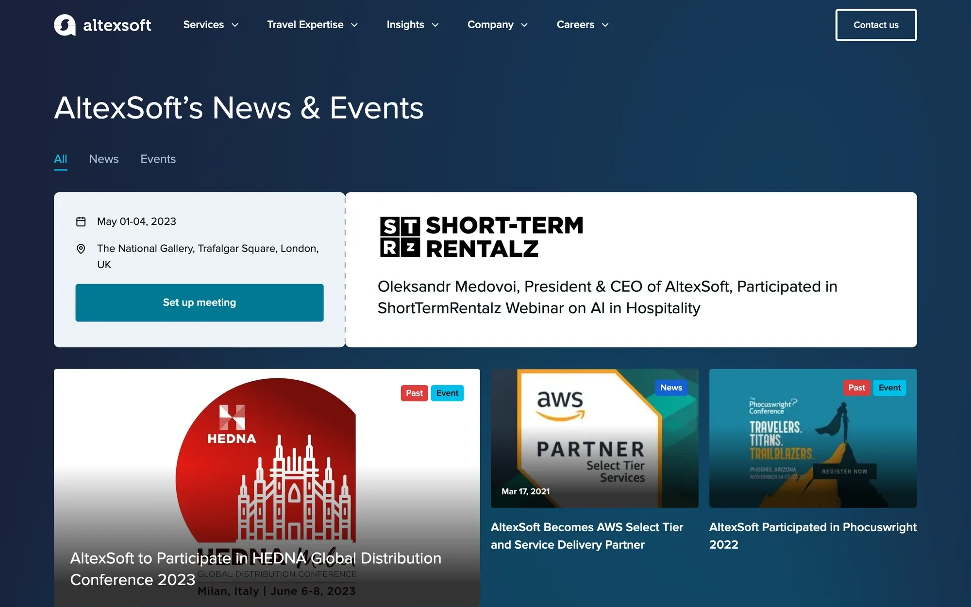
Desktop: the title band, tabs, an event card and the first posts.

The same page at 390px.
What the first build was missing
| Gap | Added to the system |
|---|---|
| Past events carry two badges, Past and Event; PostCard had one. | PostCard got a past option, and the Event badge its own colour. |
| The video blog and latest posts open with a 24px header and an icon. | SectionHeader got a small size and an icon. |
| The listing: 14 posts a page, two overlays, pagination. | A new PostGrid. |
| The video blog and latest posts columns. | A new VideoBlogSection, also for the homepage and the blog. |
| The page title band. | A new page layout of Hero. |
| The teal glow on the dark band. | Section got a glow option, shared with ContactSection. |
Found on the way: the active tab on the dark band used the live site's teal, 2.4:1 there. It now takes the link colour, cerulean.
07 / Decisions
Four decisions
behind the tokens.
69 decisions are logged, each with its reason. These four shaped the rest.
-
Names follow shadcn roles.
- Signal
The old variables were named by look, with suffixes, typos and placeholders, and nothing in code matched them.
- Decision
Semantic tokens take shadcn's role names, such as background, primary, muted and ring, plus our own, such as link, text-tertiary and the badge tones. Duplicates were merged: 103 tokens became 72. With identical names, the CSS is generated from the export instead of mapped by hand.
- Trade-off
Some shadcn names read oddly to designers: accent is a hover surface, not a brand colour. Every token carries a description that says what it is for.
- Where to see it
-
A dark section is a mode, not a copy.
- Signal
The old kit drew components again for dark sections, as a separate picture for each theme.
- Decision
A dark section switches the semantic collection to its inverse mode. Controls that paint their own white surface, such as fields, selects, chips and menus, stay on the default mode, as on the live site. The page-wide dark theme is a second axis, designed in Figma first and exported like the other modes.
- Trade-off
A pin is invisible on the canvas, and about 390 nodes are pinned. The rule is written in every component's documentation and checked on a dark frame before a component is done.
- Where to see it
-
One focus ring for every surface.
- Signal
A cerulean ring in dark sections merged with the teal button: 2.2:1.
- Decision
A two-tone ring: a 2px outline in the ring colour, 2px outside the control, with a band of the opposite colour between them. Black and white on light, white and black on dark. As an outline it follows the corner radius and survives Windows high-contrast mode.
- Trade-off
A black ring is heavier than a brand-coloured one. Being visible on teal fills and photos mattered more.
- Where to see it
-
Contrast is checked by a script.
- Signal
The 14px error messages were red at 4.42:1 on white, under the 4.5:1 that WCAG AA asks for body text.
- Decision
A contrast script runs on every export and checks each text pair in every mode. It found the error red, and error text moved to a darker red at 5.3:1.
- Trade-off
Error borders and icons took the darker red too, while the Danger badge keeps its own role. The system now has two reds, each for one job.
- Where to see it
08 / Agents and people
Agents did the counting.
People made the decisions.
AI agents worked in both Figma files and in the repository, under written rules. Every visual question was decided by a designer after seeing the options rendered.
Inventory in a day.
Through Figma's MCP server, agents read every node of both Figma files and listed each hard-coded value, broken binding and missing state. The team's time went to decisions, not to counting.
Bulk changes as scripts.
Rebinding values and building variant sets ran as 218 reviewed scripts inside Figma desktop, through a local bridge: the cloud MCP cannot load Proxima Nova, so it cannot edit text.
Code from specs.
Components were written from specs pulled from Figma, then checked against Figma side by side on the documentation site.
Rules the agents follow.
An AGENTS.md file sets them: roles only, no hex values, and a person approves every push. Lint rules keep the documentation free of internal IDs, names, dates and dot separators.
09 / This site runs on it
This portfolio is the first project
to take the tokens.
The page you are reading is built on the system: its colours in both themes, its text styles, its buttons and its focus ring come from the same export. The site is a portfolio, not altexsoft.com, so it took what fits and kept a few things of its own.
Taken from the system
- Every colour of both themes, from the system's generated CSS
- The text styles for body, labels and headings h2 to h4, the corner radius and the shadows
- The two-tone focus ring
- Button with its primary, outline and link variants and its sizes, the header links, the round icon buttons and the chip look of tags
Kept for the portfolio
Inter and round buttons
This personal site reads in Inter instead of the system's brand typeface, and its buttons are fully round.
Display titles
The system's largest style is h1 at 48px. The hero and the page titles stay larger and bold.
A monospace accent
JetBrains Mono for code, token names and section eyebrows. The system has none.
A reading width
Content stops at 1440px; the system's pages stretch to 1760px.
A 14px floor
The system's 13px small text, and the 44px button that uses it, are left out.
Two raised surfaces
Panels and their hover step, built from the system's palette, where its cards would be white on white.
Astro, not React
The components are ported by their specs: the same names, variants, sizes and states.
10 / What this page claims
Built and documented.
Not yet adopted.
- The system is built and documented, not in production: altexsoft.com has not adopted it yet. This portfolio is the only project that uses it so far.
- The dark palette is waiting for a final review.
- The second designer is still designing part of the library, such as the homepage and article heroes, the FAQ, testimonial and statistics sections, and smaller pieces like Quote, Carousel and Popover. A detailed review of the code against Figma is still to come.
- Code Connect needs a Figma plan the team does not have, so the link from each Figma component to its code lives in the component's description.
- One of the system's badge tones misses AA: Danger, white on red, is 4.4:1 for its 14px text. This page's accessibility test found it, so the demo above shows the tones that pass.
- There was no user research, and there is no adoption data. The figures on this page count the system, not its effect.
11 / What I'd take forward
What I'd take
to the next one.
Build the real page sooner.
The check page found six gaps on the last day, and each one needed a change in Figma and in code. In the first week it would have found them while the components were still open.
Write decisions down as they are made.
The log turned every settled question into a rule the next person or agent could read: 69 of them, each with its reason.
Let scripts check what eyes pass.
The contrast script found the error red. Now every export is checked again, without anyone remembering to.
Have a complex product problem?