Shopping experience × Storefront tools
One commerce platform,
many storefronts.
Helping retailers shape their storefronts through curated themes, category choices, and flexible page composition within a shared interface system.
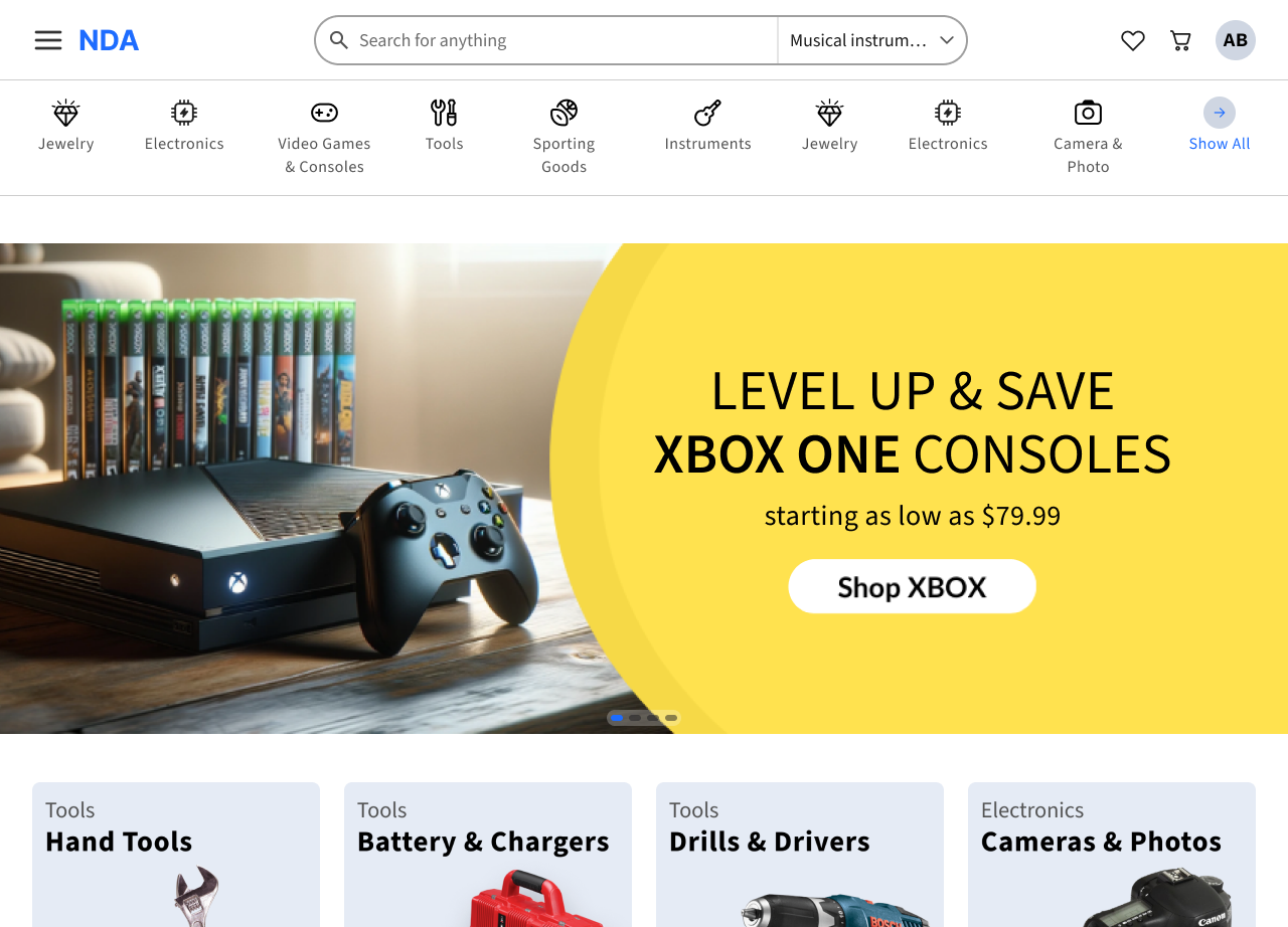

The design response
Store owners shape the look and content. The interface stays consistent.
The redesign replaces broad styling controls with prepared themes, featured content and page order.
- Set the store’s lookChoose a prepared colour family; add a logo and imagery.
- Choose what shoppers seeFeature categories and campaign content.
- Arrange the homepageReorder complete sections; keep their inner layout intact.
Client identity and sample data have been anonymized.
01 / The starting point
A clearer route into the catalogue.
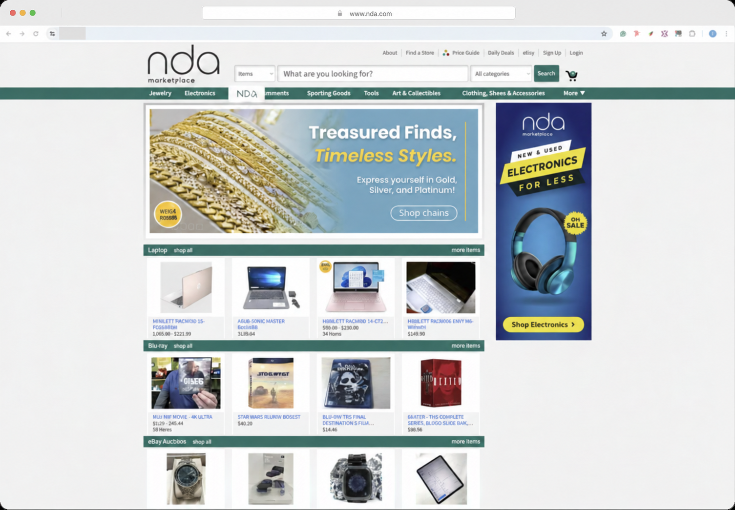
The legacy homepage crowded search and category navigation into one header while a side ad competed with the main campaign. The redesign separates direct search, category browsing and promotion into distinct areas.
A clear place
to begin
The redesigned header separates the search task from utility links and promotional content.
A distinct route
into the catalogue
Category navigation has its own band; image-led tiles give exploratory visits another starting point.
Less competing
emphasis
One campaign band replaces the main-and-side-ad arrangement. The trade-off is less merchandise in the first viewport.
The archive illustration was already edited for the project presentation. This copy adds AI-assisted redaction of the remaining browser address; small image details may differ. It is not an untouched production capture. Campaign content differs between the two designs and is not evidence of a UX improvement.
02 / The customization model
Identity stays flexible.
Interface rules stay shared.
Previously, broad styling freedom weakened consistency across storefronts. The redesign moves customization toward brand expression and merchandising: owners choose colour families, categories, imagery and the order of permitted sections; the platform keeps typography and component behaviour consistent.
The UX question
Would a store still feel like theirs with fewer controls?
We validated the proposed approach with store owners: replacing broad customization with prepared colour themes, content choices and whole-section composition. The conversation focused on what they could still express and what the shared system would take care of.
Read about the validation and its limitsThe redesign boundary
What owners can shape, and what stays consistent
The prototype replaces open-ended styling with guided choices inside a shared interface. The table shows that boundary for each part of the storefront.
The trade-off is deliberate: less freedom to reproduce any external brand system, in exchange for a more predictable storefront. These controls do not establish automatic contrast checking or accessibility conformance.
03 / Owner walkthrough
Make a choice.
See it in the storefront.
Three clips from the original Figma prototype show colour selection, category editing and section reordering. Each recording loops beside the design decision it illustrates. The accompanying description follows each interaction in words.
From store identity to a reviewable page
Journey reconstructed from the design flows. This is a task map, not an observed research-session record.
- 01 / Express the brand
Choose a starting point
The owner selects a prepared colour family and adds their logo and imagery.
The system keeps typography and component states consistent.
- 02 / Prioritize the stock
Choose what to feature
Automatic or manual category selection controls the catalogue’s entry points.
The category tile keeps its structure.
- 03 / Compose the page
Move whole sections
The owner changes the order to match the store’s merchandising priorities.
The layout inside each section stays intact.
- 04 / Review the result
Check before publishing
The review flow brings the changes together before the publication step.
The prototype shows the flow; live publication is not established.
A / Colour family
Choose a family, not every colour.
Prepared palettes give each store a distinct visual expression within the shared system.
How it works
- One colour family updates the category tiles through shared colour roles.
- Typography, component behaviour and page layout stay consistent.
Curated palettes may not match every external brand colour exactly.
B / Category selection
Edit the thing you can see.
Category settings sit beside the storefront, keeping each choice in context.
How it works
- Owners can use automatic selection or choose a category manually.
- Manual selection turns automation off and updates the storefront tile.
Manual categories need ongoing curation to stay relevant.
C / Page composition
Move a section. Keep its structure.
Named handles let owners change the order of permitted homepage sections.
How it works
- A moving section collapses into a compact placeholder.
- The section keeps its internal composition in its new position.
Owners reorder permitted sections; layouts within them stay shared.
04 / What the shopper gets
Different stores.
Familiar buying decisions.
The same structure continues from discovery to product evaluation, a cart grouped by retailer, and checkout. Store identity can change without asking shoppers to relearn these decisions.
01 / Discovery
Search, browse and discover products.
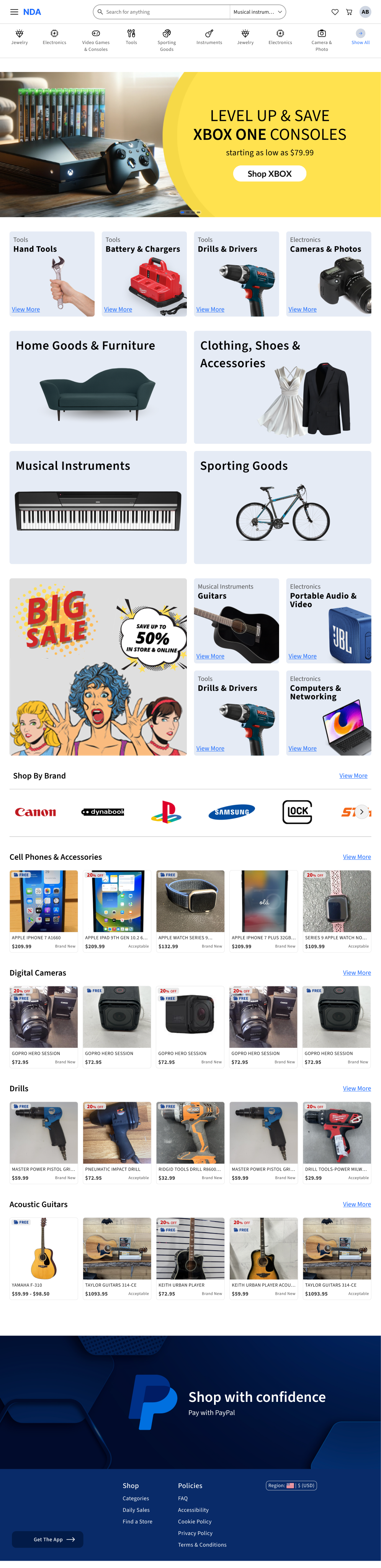
Search helps shoppers find a specific item. Categories, campaigns and product collections offer starting points for exploring the catalogue.
02 / Product evaluation
Keep the decision beside the item.
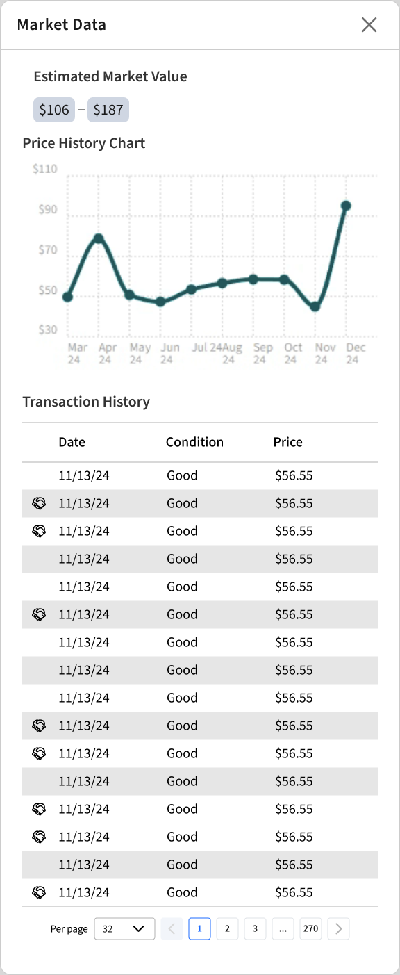
Price, delivery and purchase actions stay together. Great Price lets shoppers check market context before deciding.
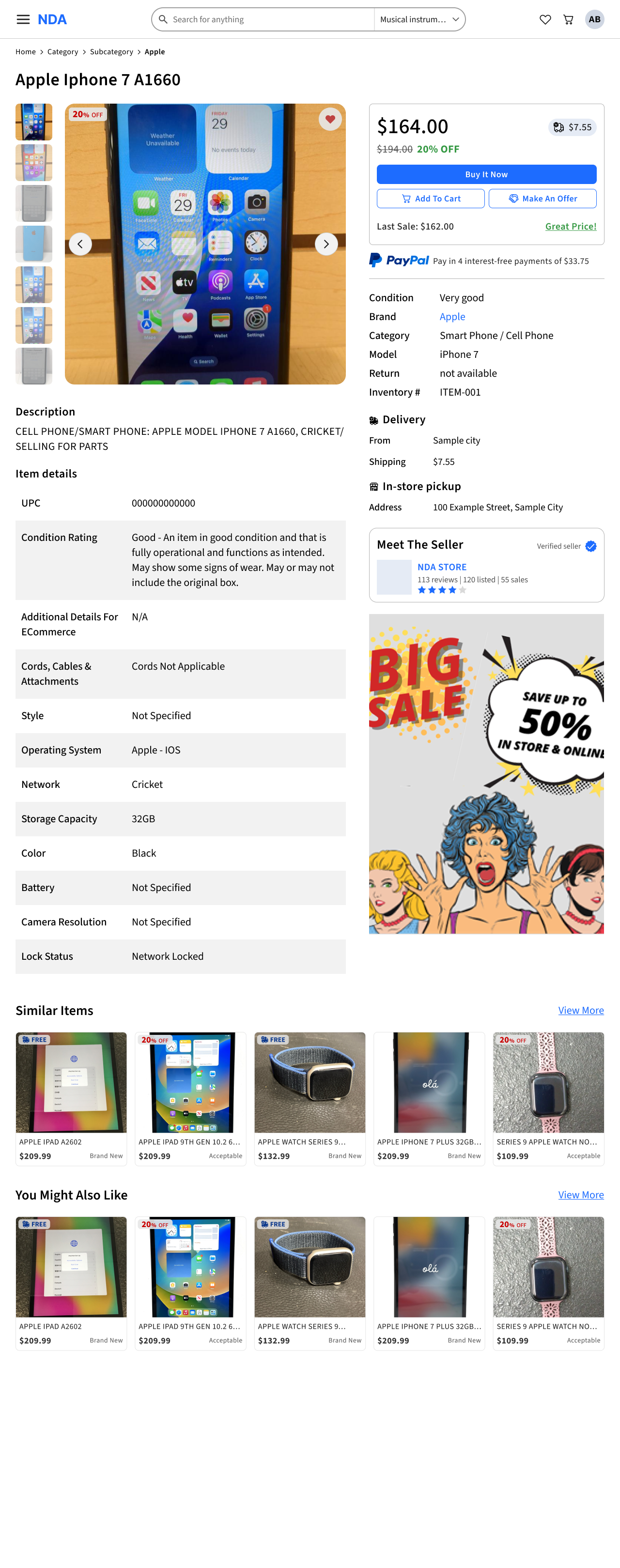
Screen excerpt. Open full size to explore the complete design.
- The purchase panel stays beside the product photography.
What makes it a Great Price?
The source popup brings together an estimated market-value range, a price-history chart and transaction history.
Open Great price details
Screen excerpt. Open full size to explore the complete design.
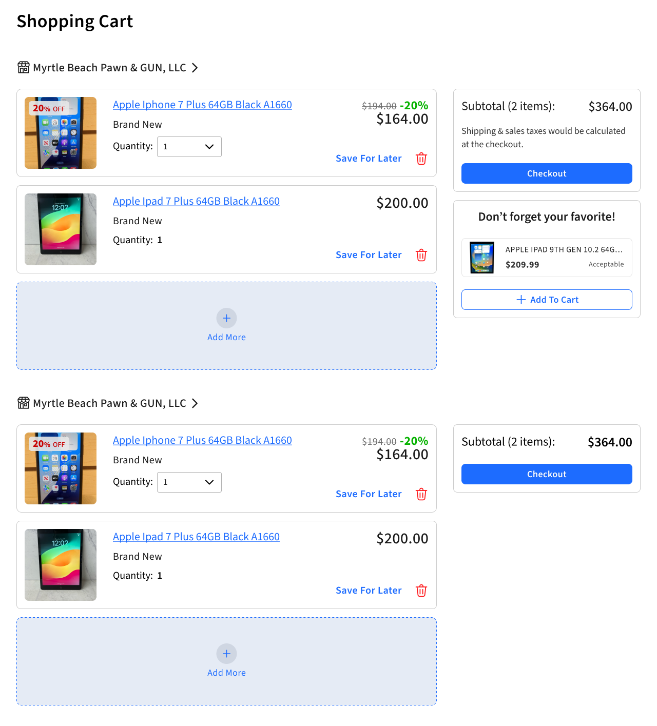
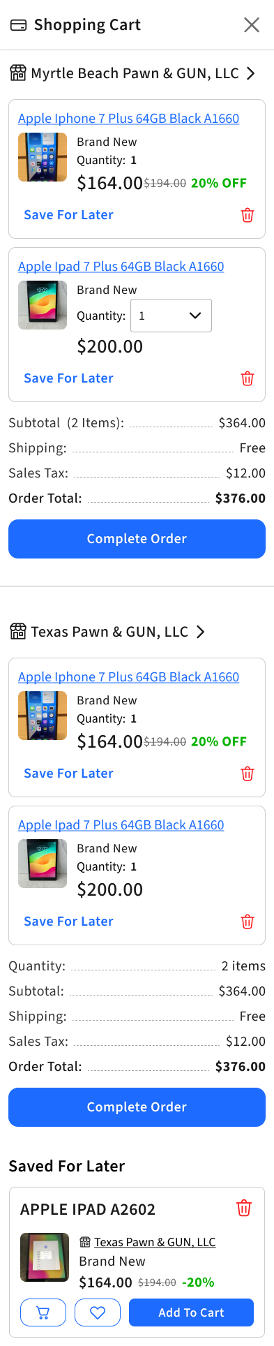
03 / A cart across stores
One cart. Separate retailer orders.
Store headings define each group of items. A subtotal and checkout action belong to that group, so the retailer boundary stays visible as the cart grows.
04 / Checkout
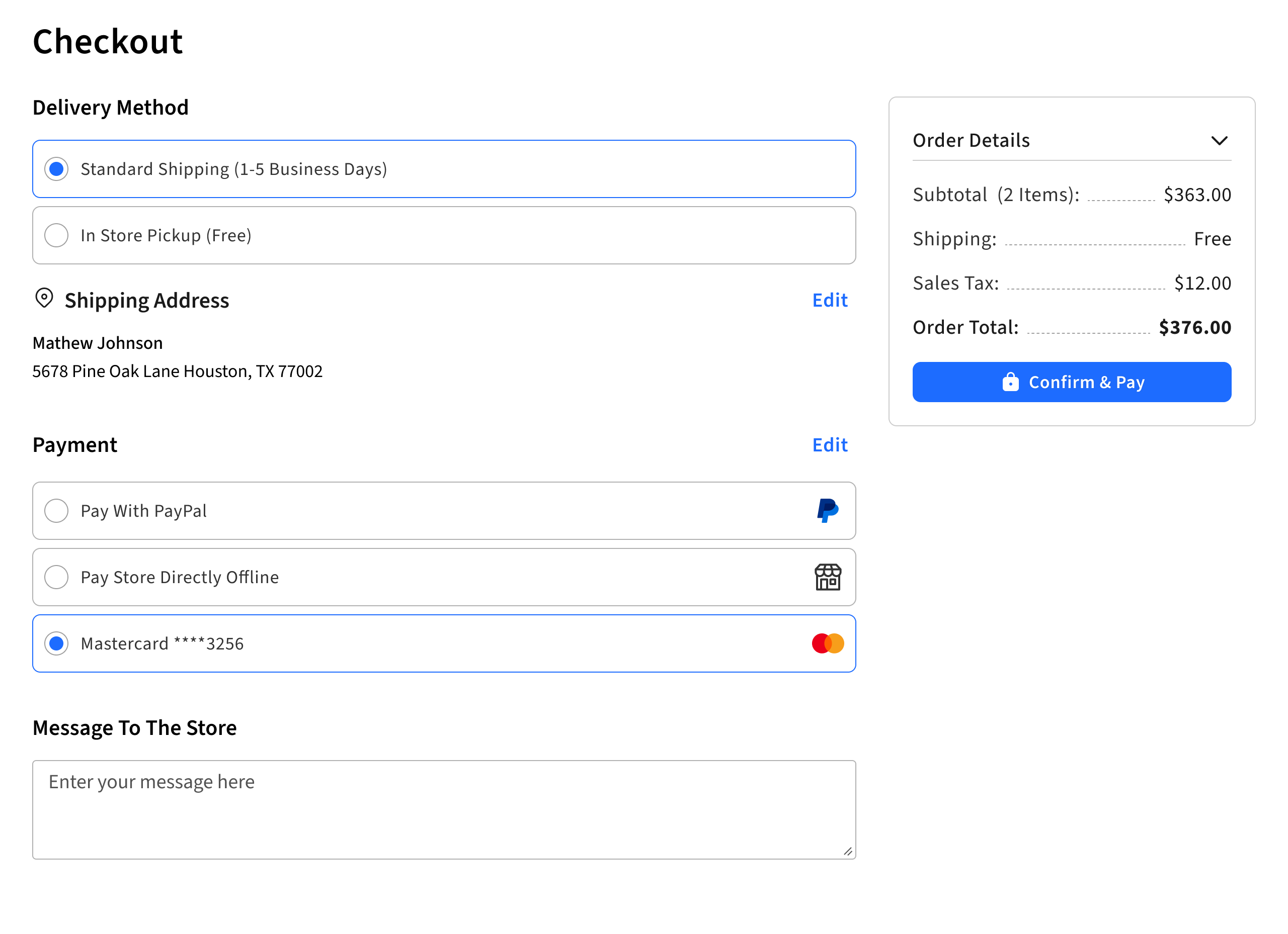
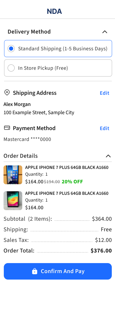
Review the order in its full context.
Delivery, address and payment sit alongside the order summary on desktop. Mobile stacks the same decisions, with the total and confirmation after the form.
05 / The shared library
One library.
From foundations to storefronts.
Retailer identity needs room to vary. Shopping behaviour needs to remain recognizable. Start with the foundations, follow them into components, then compare the storefronts they support.
Library foundations / Colour
Nine colour families. One palette structure.
Each family has seven steps, from quiet surfaces to strong accents. All nine source families are shown here, including both red variants. Neutrals and feedback colours keep their own roles across storefront themes.
Blue
#E5EBF5#CFD6E2#B8C7E5#1D6CFF#0D398C#092B69#021B48Purple
#E7E5F5#D2CFE2#BFB8E5#492EE5#200D8C#170969#0A013DMagenta
#EDE5F5#D8CFE2#CDB8E5#872EE5#4A0D8C#370969#1E013DRed Pink
#F5E5E8#E2CFD2#E5B8BF#CC2936#990F1B#550816#340009Red Warm
#F5E9E5#E2D3CF#E5C1B8#D53200#992F0F#551A08#340D00Orange
#F5EAE5#E2D5CF#E5C6B8#D04804#8C370D#692909#481A02Yellow Gold
#F5F2E5#E2DFCF#E5DEB8#A78C00#7F6A00#423700#2B2400Green Warm
#EAF5E5#D5E2CF#C7E5B8#3C8219#306614#1E400D#142F07Green Cold
#E5F5ED#CFE2D8#B8E5CF#1A804D#14663D#0D4027#072F1BSeven steps per family: 100, 200, 300, 500, 700, 800 and 900. On smaller screens, scroll across the palette to compare values.
Neutral / Grey
Source colour variables- Grey / 50
#F2F2F2 - Grey / 100
#E5E5E5 - Grey / 200
#CCCCCC - Grey / 400
#9F9F9F - Grey / 600
#6C6C6C - Grey / 800
#333333 - Grey / 900
#1A1A1A
Feedback / System
Shared across themes- Error
#FF1215 - Success
#06B200 - Warning
#D38900 - Alert
#C80000
Library foundations / Typography
One family. A clear hierarchy.
The library’s type roles extend into the product screen: the price leads, the title identifies the item, and attributes and actions form the next levels.
Source
Sans 3
From product information
to interface controls.
$164.00
Apple iPhone 7
Condition
Great Price!
Buy It Now
View more
Product name
Selected roles from the library and product design, rendered in the source typeface.
Library foundations / Geometry
Proportion follows the task.
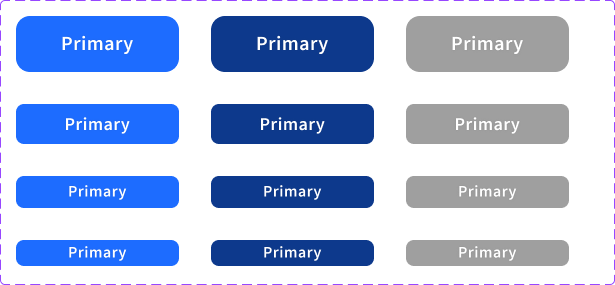
Four action sizes support different levels of density. Height and label size change together, while spacing and corner treatments belong to the component.
| Size | Preview | Height | Label | Gap | Padding | Radius |
|---|---|---|---|---|---|---|
| L | Primary | 56 | 20 | 8 | 14 / 20 | 14 |
| M | Primary | 40 | 18 | 6 | 8 / 16 | 8 |
| S | Primary | 32 | 16 | 4 | 8 / 16 | 8 |
| XS | Primary | 26 | 16 | 4 | 8 / 16 | 8 |
Padding is vertical / horizontal; gap is the space between an icon and its label. Previews show source proportions and are not interactive.
Library / Component states
The same rules, through every state.
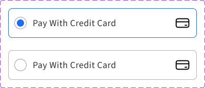
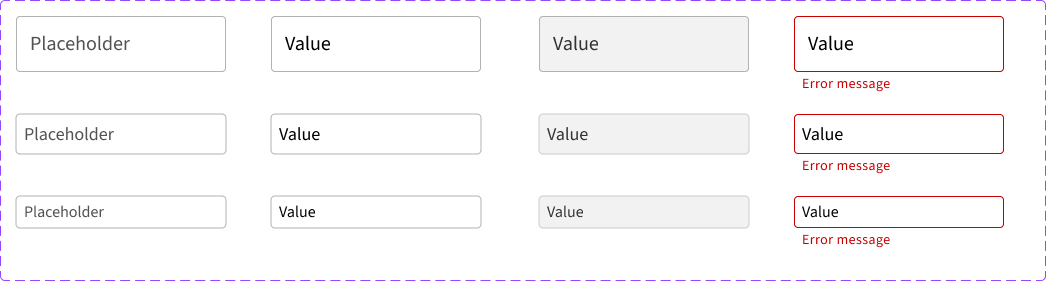
Actions, selection controls and fields make the foundations usable. These source specimens show the default, pressed, selected, disabled and error treatments that recur in the shopping experience.
Actions
Four sizes, with enabled, pressed and disabled states.
Selection
Exclusive choices and independent on/off states.

Fields
Empty, filled, disabled and error states across three sizes.
From components to a product card
Photography leads. Price and condition support comparison, while badges add context without changing the card’s structure.
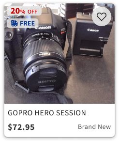
- NoticeProduct photography and promotional signals.
- CompareTitle, price and item condition in a consistent order.
- Keep or continueA favourite action beside the image; the card leads into product evaluation.
Original component exports. See how the library comes together in the shopping journey ↗
Library / Applied
The foundations become storefronts.
Eight supplied designs bring the library into context. A retailer’s colour family changes the identity while familiar components preserve the shopping structure.
Eight colour families. One storefront system.
Open any screen for a closer look. Scroll sideways to compare all eight.
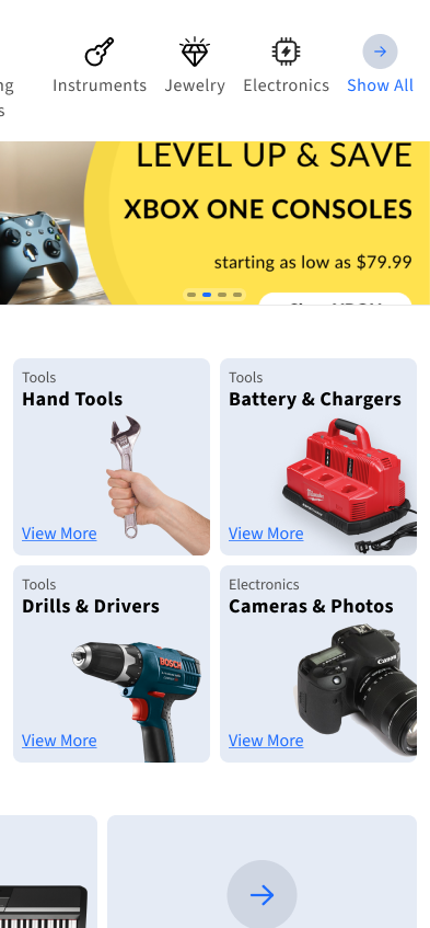
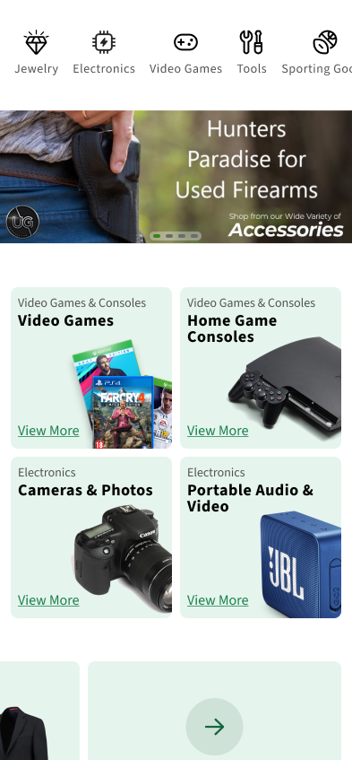
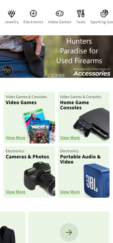
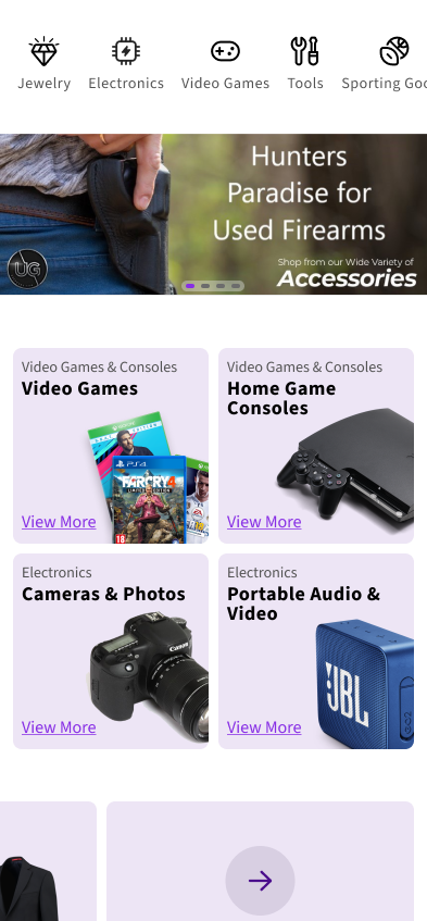
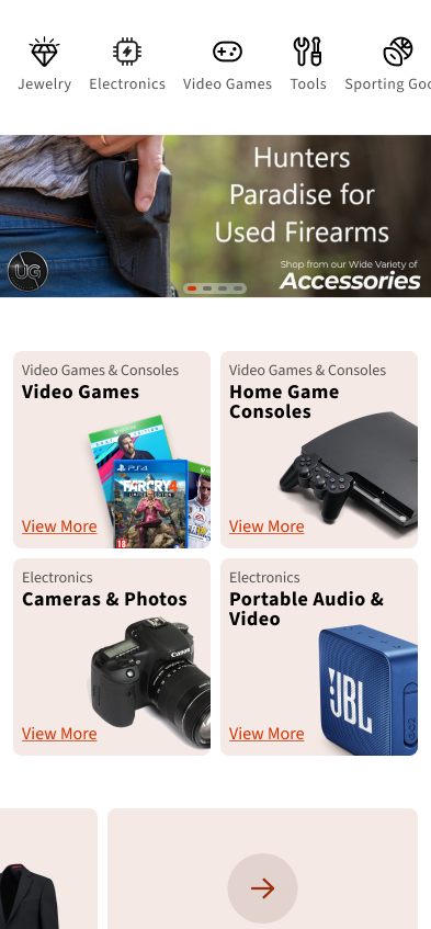
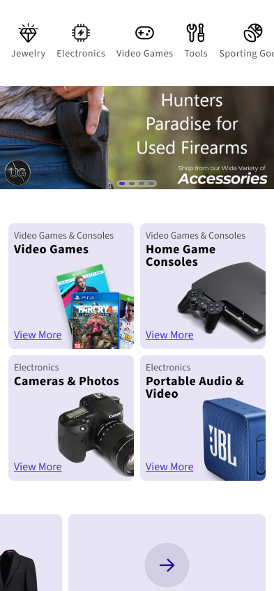
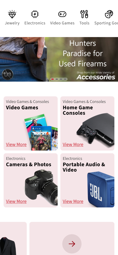
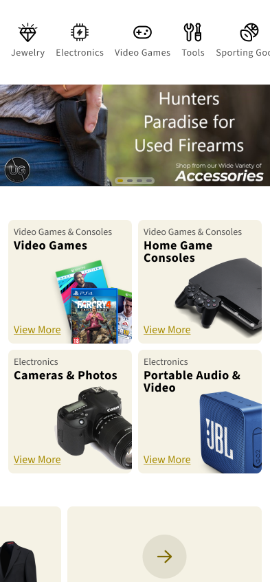
The mobile designs show how accent colours and subtle card surfaces vary across eight themes. Navigation, typography, and category-card structure stay consistent; the blue example also shows different promotional content and categories.
VariableColour family, imagery, merchandising priorities
SharedTypography, navigation pattern, category-card structure
06 / Validation with store owners
The tighter boundaries
were part of the conversation.
We reviewed the proposed customization model with store owners. The central question was whether prepared themes and content choices gave them enough room to express their store while removing many styling controls. The author’s account records support for this direction.
What the review supports
Acceptance of the direction
The review addressed the trade-off itself: owners would give up detailed styling control in favour of guided brand and merchandising choices. It supports acceptance of the proposed approach.
The next evaluation
Complete tasks in context
A follow-up task study could examine how owners choose categories, review the mobile storefront and prepare changes for publication.
The next proof is behavioural.
Can owners predict when manual choices disable automatic selection? Can they check the mobile result before publishing? Can shoppers keep track of the retailer through checkout?
The project documentation describes team discovery and refinement work, but no specific research findings or personal research credit are inferred from it. Presented as UX/UI design and Figma prototype work; production rollout and accessibility conformance are not established.
Have a complex product problem?